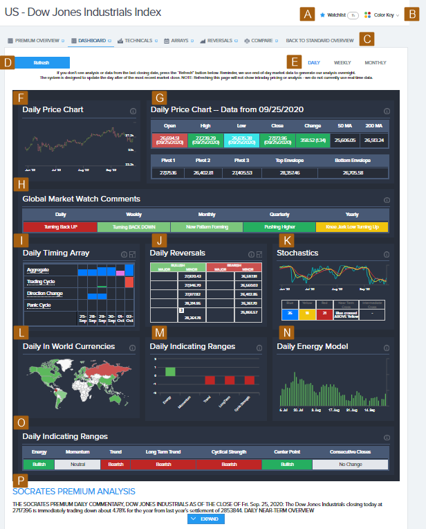
View the Dashboard for a Market
The Dashboard for a covered market is available to Pro members.
It is a unique, consolidated view of key market activity and model analysis that takes information from the Premium Overview and shows it in a graphical format for daily, weekly, and monthly time levelsOne of the five key viewpoints of time into which analysis is divided: daily, weekly, monthly, quarterly, and yearly. Also called a time frame..
In the Pro Member Premium Tools, select the Dashboard tab to see the Dashboard for the selected market.

- Show your watchlist.
- Show the GMW color key.
- Return to the Pro Member Grid View.
- Refresh the information on the page.
- Change the time level.
- Pricing chart with historical data. Select the chart to show a full-page version with a full set of chart tools.
- Price and moving averages for the selected time level, similar to the pricing and moving averages in the market data tables.
- Condensed GMW information for each time level.
- Condensed arrays for the selected time level. Select Expand
 to go to the Arrays tab.
 - Reversals for the selected time level. Select Expand
 to go to the Reversals tab.
 - Stochastics information for the selected time level, similar to the stochastics information in the market data tables.
- Global capital flows heat map that shows a high-level picture of the most recent flow of global capital, similar to the map on your Homepage. Hover over a country to show detailed information.
- Indicating range information for the selected time level, in chart format.
- Energy model analysis of the relative push-and-pull force between the bulls and bears in the market for the selected time level. Hover over a line to show detailed information.
- Indicating range information for the selected time level, similar to the Indicating Range information in the market data tables.
- Premium analysis text for the selected time level. Select Expand to see the full report.